Showing posts with label Statistics. Show all posts

Monday, June 20, 2022

Rhetorical Tricks: Water Edition

 Sometimes, I read something that makes me so mad, I dash off a quick email to a friend who gets it. This time, I sent it off to the entire LWVC googlegroup and got some 'attagirl' affirmations back. So, let's share this take down. 

First, read These five people could make or break the Colorado River. Do you see what is wrong with this quote by one of the five people, Imperial Irrigation District (IID) commissioner J. B. Hamby? 

Hamby also pointed to the huge amounts of water that are still wasted, in his view, in cities such as Los Angeles. "It’s very easy to point at the alfalfa field, but what about drying out the lawns and useless grass?"

 The Colorado River (CR) is subject to all sorts of unrealistic math, well-documented elsewhere. We have these benchmark Colorado River allocations based upon 16.5 Million Acre Feet (MAC). Mexico gets 1.5 MAF, and the Upper and Lower Basin states get 7.5 MAF each. 

California gets the lion's share. In the benchmark scenario, farmers, mostly the IID, get 3.85 MAF out of California's 4.4 MAF. The remaining 0.55 MAF goes to the Metropolitan Water District (MWD), who sells it wholesale to 19 Million urban users based on a system of rights allocated decades ago.  It's roughly a 70/30 split between farmers and urban users before water rights transfers. (Cities buy about 0.5 MAF of CR water allocations from farmers.)

In practice, the CR does not have that much water and IID gets around 2.5-2.6 MAF and the cities get about half that, and then purchase more from farmers. 

IID commissioner Hamby pointed to LA lawns in a rhetorical trick called misdirection. It's often employed by magicians so you don't look at what they are really doing. 

Let's do the math! 

If we take him literally, let's run the numbers for the City of Los Angeles' Department of Water and Power, LA DWP. 

IID receives 2.5-2.6 MAF from the CO River. LADWP uses 0.5 MAF/year from all sources and serves 4 M people. An acre-foot serves 8 Angelenos for an entire year. (An acre foot serves 20 apartment dwellers in new, efficient homes!) 

About half is imported river water purchased from Metropolitan. 0.25 MAF The exact mix of SWP and COR water each year varies based on availability, but figure half on avg. 0.125 MAF 

City of LA residents are pretty water thrifty. About 1/3 might be outdoor use (perhaps 1/4). Not all of the outdoor irrigation in LA is lawns. Trees and shrubs are necessary to improve urban livability. 

Even if it were all lawns, we're down to (at maximum) 0.125 MAF/3 or 0.04 MAF compared to 2.5-2.6 MAF for the farmers of the IID. 

Anyway, finger pointing is a standard rhetorical trick to hijack the discussion. As always, verify. Does not pass the sniff test. 

Hamby said some other whoppers, which I won't go into here until I finish some other work with real deadlines. 

Monday, June 13, 2022

Vacancy Truths 2

I got asked this again and decided to publish this as a blog post instead of in an email because this is such a common misconception. 

First, read Vacancy Truths from September 2021 for background. There's a link to Darrell Owens' explanation about why home might be vacant and what we can learn from US Census Data. If a rental changes tenancy every 2 years, and it takes a month to clean/rehabilitate/lease out the rental. Thus, a 1/48 or 2.1% vacancy rate can mean essentially no open homes available. 

As housing stock gets older, it takes longer to rehabilitate the units. Supply chain issues are also increasing the amount of time it takes to build new homes or spruce up old ones.  It's not unusual to spend 2-6 months remodeling. A major SoCal developer announced to investors that home building is taking 6-8 weeks longer due to lack of materials and/or workers, citing kitchen cabinets as a major pain point.

The particular question from yesterday was from new homes in Pasadena, CA. She was sure that the new buildings in Pasadena are vacant and that developers get tax breaks to keep them vacant. 

Intuit explains that there is no tax break for loss of income while a rental (or for-sale) home is vacant. A lot of subsidized homes are built with the Low Income Housing Tax Credit (LIHTC). Wait lists for subsidized homes are years (often decades long), so there is no difficulty filling the homes.  If there are people who need subsidized homes, and you keep LIHTC-financed homes empty, you lose your tax credits. No sane builder would do that. I checked the most recent HUD data on LIHTC units (nationwide data) and they had a 3.97% vacancy rate in 2019.

Darrell Owens has helpfully extracted US Census data from 2010 and 2020 for all cities in California and shared it in a Google Sheets. 

In 2010, Pasadena had 59,551 homes (4,281 vacant) and 137,122 people

In 2020, Pasadena had 61,643 homes (3,659 vacant) and 138,699 people

This means that Pasadena added more homes than people in the last 10 years. This is not a failure in planning. This reflects the general trend of households (HH) trending smaller and older people staying in their homes longer, even if they don't need all that space. Younger people can't afford the single family homes (SFH) or don't have the down payments required to purchase SFHs or condos, so they end up living in the apartments downtown. 

It's possible that some of the new infill homes in central Pasadena are vacant, but they may still be under construction (lack certificate of occupancy), rentals being readied for a new tenant, or be for-sale condos waiting for a buyer. (For-sale homes are vacant longer than for-rent homes.)

Let's look at the data from the SCAG Local Profiles for communities in the 6-county (Ventura, LA, OC, Riverside, San Bernardino, Imperial) SCAG region. I pulled these charts from page 12 of the Pasadena Local Profile, 2018. They are derived from building permit data. Some of them are rebuilds and do not produce net new homes. (Likely source of discrepancy between the SCAG and Census data.)

Pasadena has done a better than average (for the region) job of building new homes in the downtown area. That is also why so many young people live there. New people (young people forming households, newcomers to the area) will flock to where the open homes are.

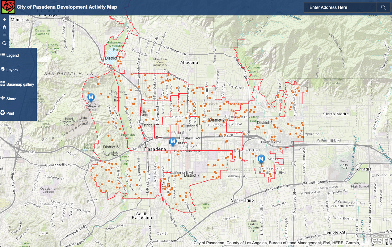
It may seem like there is a lot of construction, especially downtown, but it's a sampling bias. The City of Pasadena Development Activity Map shows building permits distributed throughout the city, but many of them are remodels or ADUs. The big construction projects are downtown, along major streets and freeways, because that is the only place cities allow them to be built. If we are driving around on the major roads (as most of our driving should be) we'll see more of the major projects. Explore the map; click on the orange dots to view data on each building site.


I checked Apartments.com and there are 164 apartments available for lease in Pasadena with next day occupancy (June 14, 2022). I checked Zillow and it shows 218 homes for sale and 152 for rent. I checked hotpads.com and it shows 279 apartments for immediate lease. Anyway, that's well under 1% of rental homes truly vacant, looking for a renter. Sounds like a very tight housing market. 

Rate.com says that Pasadena has a 1.2% homeowner vacancy rate and a 2.9% rental vacancy rate. I found it informative to compare Pasadena and Redondo Beach. That "little old lady from Pasadena is real; 27% of Pasadena residents are seniors. But 25% are 20-34.


Compare with Redondo Beach, where 33% are seniors and 19% are 20-34. 


Pasadena has 53% working age population (20-64) supporting 47% elderly (65+) or youngsters (0-19) for a dependency ratio of 0.89. Redondo Beach has 44% working age population supporting 56%, for a dependency ratio of 1.27. If you don't provide for young people, then your children will have to move elsewhere, and that can socially isolate the elderly as they age out of driving. My home town of Redondo Beach is facing the Silver Tsunami with no plan.


Wednesday, March 30, 2022

CA Car Rebates and Our Underfunded Active Transportation Program

There's been much hoopla about California's budget surplus and high gasoline prices. So why not use some of that surplus to alleviate pain at the pump? That may be good political messaging when the impetus is the much more mundane Gann Limit on CA public spending. The ghost of Howard Jarvis strikes again. Not content to limit just property taxes, they sponsored and got the electorate to approve caps on overall spending that limit public investment overall.

I don't want to belabor the stupidity of giving people who own cars $400 per car, up to $800 per person, while not similarly rewarding people who are either too poor to own cars and/or care enough about the common good to not own a private car in the first place.

In a world without all the stupid laws that we inherited, we could have fully funded our Active Transportation Program (ATP) to increase the proportion of trips accomplished by biking and walking.  The majority of ATP-funded projects are Safe Routes to Schools--to help children get safely to and from school. Basically, we need to protect kids outside of cars from the cars chauffeuring them around. 

Because of limited funding, ATP grants are extremely competitive. 

In 2014, cities and counties across the state requested about $1 billion in funding for pedestrian and bicycle safety projects, but there was only $368 million available, meaning about 37 percent of applicants were funded that cycle. Fast forward to Cycle 5 in 2020 when over $2.5 billion in funding requests were submitted for $554 million in available funding, a success rate of about 22 percent. In Los Angeles County, only 14 of 64 applications were awarded even partial funding, or 22 percent total – demoralizing, yet consistent with the statewide average.


The 2023-24 ATP budget is even grimmer. ATP has $147,670,000 to spend that is not already committed to other projects. That means, the 6-county SCAG region of 20 M people (including LA County, has only $31,242,000 or about $1.50/resident. 

In contrast, Governor Newsom's proposed 5-year infrastructure plan will devote $10 B to electric cars and $20 B for roads, roughly $5 B/year (pages 7-8).  This isn't even counting the $ spent on CHP and traffic enforcement. Due to the Gann limit, every $ spent in one place is a $ we can't spend somewhere else. This is extremely discouraging. 

In the mean time, we depend on volunteers and advocates such as Safe Routes Partnership to help communities hone their proposals to improve their odds of winning an ATP grant. "In ATP Cycle 5, four out of the five communities we worked with scored an 86/100 or above." In other words, communities can compete to get technical help to further compete to get funds to improve street safety for school children. 

My community finally won an ATP grant, but the funds allotted are well short of what we really need to remodel our streets.  We're likely to end up with some paint and street signs. Sigh. 

We have so much work to do. Spend some time exploring the California ATP Transportation Injury Mapping System.  (You need to register to create a free account, but it's worth it. UC Berkeley researchers built the system and don't do anything nefarious with your search terms.)

Here's a heat map of the 2017-2021 carnage. 


People who live in the neighborhoods with the larges blotches of red are least likely to own a car but most likely to be killed or maimed by one.  In Los Angeles County, over 5 years, 173 cyclists dead, 1323 pedestrians dead, thousands more injured and maimed. Their lives will forever be marked by pain and disability. (I'm not even counting the effect of air pollution in their neighborhoods.)


The Gann Limit requires CA to give out rebates. I wish that the rebates be used for restorative justice instead of rewarding people for owning cars. Who's with me?


Tuesday, September 28, 2021

Vacancy Truths

Every heard about Vacancy Truthers?  They are people who deny that we need to build more housing. I hadn't heard of them either until I started attending housing forums to advocate for building more housing. Darrell Owens has written an excellent article about the Vacancy Debate.  Please read it.


What is the right level of vacancy?  It was shocking (but welcome!) to arrive in Redondo Beach in the middle of a recession and have lots of apartments to choose from.  Housing seemed abundant, even though the vacancy rate wasn't over 10%.  It just felt relatively abundant because Bad Dad and I had become acclimated to housing scarcity.

It feels wild to read a paper about Homeless in America, Homeless in California by John M. Quigley, Steven Raphael, and Eugene Smolensky.  The 1990s seemed so long ago, and we can only dream about vacancy rates and rent to income ratios like this.


This paper was published in 2001 in Harvard/MIT's The Review of Economics and Statistics.  They analyzed the numbers from around the country to study homelessness and tested two hypotheses.  They debunked the hypothesis that homelessness was primarily caused by Reagan-era policies to close Mental Hospitals.  If this was true, then there should be a positive association between homelessness and patients released from mental hospitals in different cities and over time.  They didn't. 

Instead, they saw the opposite.

They then looked at vacancy rates, rise in rents, and rent to income ratios.  Bingo, that's why California is a homeless magnet.  California is special because we have the most extreme housing scarcity.  For each increase in vacancy rate from an average of 6.7%, there would be a 25% drop in homelessness.  The opposite can happen.  If vacancy drops, conditions allow landlords to raise rents, and more people fall into homelessness.

Economists broadly agree that a 5-7% vacancy rate stops rents from rising.  Los Angeles' vacancy rate was 4.2% in 2017. 


The rent is too damn high, which means that people on low fixed incomes (SSI, non-wealthy retirees, Section 8 voucher holders) cannot find housing that fits their budget.  This is why Redondo Beach has unused Section 8 vouchers.  My preferred policy choice is to make housing more abundant, so that the vacancy rate rises and rents come down. 

California has made a different choice.  We seek only to staunch the bleeding, but not to heal the patient by bringing rents down.  In the 6th Round of the Regional Housing Needs Assessment (RHNA), cities only have to plan for enough housing to raise the rental vacancy rate to 5% and the owner vacancy rate at 1.5%.  


There is no natural reason why for-sale homes have to be so scarce.  That's a policy choice to prop up sky-high home prices that are already unaffordable for most Californian workers. 1.5% still perpetuates rising prices.  The data since 2017 is even more grim.  California's owner vacancy rate in 2020 was 0.7%, which fomented bidding wars and home sale prices climbing at double digit rates in the midst of a pandemic.


Tuesday, May 12, 2020

The inequality of COVID-19 deaths

The data and data analysis is rolling in on the inequality of COVID-19 and it doesn't paint a pretty picture about our society. I'm not going to dwell on it here because regular readers will know how I feel about that and how hard I am working using my limited bandwidth and my personal need for emotional distance from the enormity of it all.

Let's just discuss air pollution, statistics and bicycling--three perennial favorite blog topics.

First off, read the synopsis of Exposure to air pollution and COVID-19 mortality in the United States: A nationwide cross-sectional study. You can also read the full study on Medrxiv.org

Results: We found that an increase of only 1 μg/m3 in PM2.5 is associated with an 8% increase in the COVID-19 death rate (95% confidence interval [CI]: 2%, 15%). The results were statistically significant and robust to secondary and sensitivity analyses.

Conclusions: A small increase in long-term exposure to PM2.5 leads to a large increase in the COVID-19 death rate. Despite inherent limitations of the ecological study design, our results underscore the importance of continuing to enforce existing air pollution regulations to protect human health both during and after the COVID-19 crisis. The data and code are publicly available so our analyses can be updated routinely.
This is only county-level data and represent deaths only up to April 22, 2020.*
Fig 1: Maps show (a) county-level 17-year long-term average of PM2.5 concentrations (2000‒2016) in the United States in 𝜇g/m3, and (b) county-level number of COVID-19 deaths per 1 million population in the United States up to and including April 22, 2020

A risk ratio is the amount of risk you incur relative to some baseline or reference group.  The baseline can be the average, e.g. the average air pollution exposure of all people.  In the case of Black people, the ratio is computed relative to all people who are not Black.

Earlier estimates pegged an increase of 1 𝜇g/m3 in PM2.5 with an 15% increase in the COVID-19 death rate.  The analysis was recomputed taking into account confounding variables to separate out the risks of being poor, being black, density, etc.

It turns out that living with more pollution is deadly--even just 1 𝜇g/m3 more of long-term PM2.5 exposure increases your risk of dying should you catch COVID-19 by 8%.  For context, the national average is 8.4, 𝜇g/m3.  The California legal limit is 12 𝜇g/m3 and the Federal limit is 15 𝜇g/m3.

Table 3: Mortality rate ratios (MRR), 95% confidence intervals (CI), and P-values for all variables in the main analysis.
Being black in the US is deadly.  COVID-19 is no exception.  It increases your risk of dying by 45% (1.45 ratio relative to non-black people living with the same air pollution exposure.) P-value** is a measure of how sure we are of the finding.  A lower number means we are more sure.  In this case, there is zero doubt that anti-black racism kills.

In contrast, the association with density is less certain.  A p-value of 0.40 means there is a 40% chance the association isn't really true.  Better than 50/50, but still weak.  The association with home ownership is stronger (but still weak)--perhaps because older people are more likely to own their homes?

Anyway, I just want to point out that racism and environmental racism kills.

Because of the link between air pollution and COVID-19 mortality, governments around the world are trying to keep people from getting back into cars.  In Los Angeles, we have done nada, zip, zilch.

An emergency bike lane in Bogotá, Colombia, March 2020. Photo by Gabriel Leonardo Guerrero Bermudez/iStock
* I live in anomalous Los Angeles County, the most populous county in the US with 10 Million residents and 88 cities.  In contrast, NYC has 8.4 Million people in 5 counties that make up 1 city.  I look forward to more granular analyses of within-county differences later.

** Physics professor Eric has written an excellent guest-blogger series clearing up misconceptions about P-values.

I've got a busy day ahead so I'll save the rest for later.

Thursday, August 03, 2017

Why are white people so afraid?

It turns out, white people who live among white people are at highest risk of being murdered or dying of illicit drugs.  Mike Males crunched the numbers in an LAT opinion piece.
I examined Centers for Disease Control statistics on murder, gun killings and illegal-drug overdoses among white Americans.
...
Rates of homicides, gun killings and illicit-drug fatalities are highest in counties where nine in 10 residents are white and where President Trump won.
...
Such counties are not limited to one geographical region. They include Boone County, W.V.; Washington County, Utah; Baxter County, Ark.; and Brown County, Ohio.
...
Overall, white Americans who live in predominantly white and Trump-voting counties are 50% more likely to die from murder, gun violence and drug overdoses than whites who live in the most diverse and Democratic-voting counties. The more white and Republican a county is, the greater the risk for white Americans.
...
Correspondingly, the white Americans who are safest from such deaths are those who live in racially diverse areas such as Los Angeles, New York and Chicago, where two-thirds of residents are nonwhite, where millions of immigrants live, and where voters favored Hillary Clinton in 2016. Nonwhites also are safer in these areas overall, though rates vary by location.
The last sentence is at the crux of the BLM movement. If you examine the evidence, white on black crime due to irrational fear, is the bigger crime problem in this country.  Trayvon Martin is not an isolated case.

Stand your ground laws make it impossible to convict someone of murder if they claim that they felt that their life is in danger.  If white people persist in irrationally believing that black people are dangerous, then they can legally get away with murder.  This is the new lynching.

It is the job of all of us to push back against irrational fear.  Don't let people like Trump get away with spouting lies without pushing back.  The lives of our fellow human beings depend on this.
Chawne Kimber's Self Study #4: the one for T

Tuesday, September 20, 2016

Pushing back against Weapons of Math Destruction

I'm such a huge Cathy O'Neil fan, that I put Doing Data Science: Straight Talk from the Frontline on my very short list of recommended books for scientists and data scientists. I wrote:
The most hands-on of the meta books or the most meta of the hands-on books? Not many introductory books include a chapter on ethics but more should.
Weapons of Math Destruction is the book about data science ethics that I've been waiting for.


Listen to the interview with author Cathy O'Neil on All Things Considered.

I especially like this exchange:
MCEVERS: So it sounds like when you're saying, you know, we have these algorithms, but we don't know exactly what they are under the hood, there's this sense that they're inherently unbiased. But what you're saying is that there's all kinds of room for biases.

O'NEIL: Yeah, for example, like, if you imagine, you know, an engineering firm that decided to build a new hiring process for engineers and they say, OK, it's based on historical data that we have on what engineers we've hired in the past and how they've done and whether they've been successful, then you might imagine that the algorithm would exclude women, for example. And the algorithm might do the right thing by excluding women if it's only told just to do what we have done historically. The problem is that when people trust things blindly and when they just apply them blindly, they don't think about cause and effect.

They don't say, oh, I wonder why this algorithm is excluding women, which would go back to the question of, I wonder why women haven't been successful at our firm before? So in some sense, it's really not the algorithm's fault at all. It's, in a large way, the way we apply algorithms and the way we trust them that is the problem.
I hope you read or listen to the interview. Perhaps we can do a virtual book club and read it together?

In case you were not a reader of this blog in 2008, I wrote about my experiences using a proto credit-scoring algorithm while in high school student working part-time for Citicorp in the mid-1980s.  I did (with my boss' support) what I could to push back against arbitrary scoring algorithms when I felt they did not accurately capture an applicant's credit-worthiness.  It's also a time capsule for a time when we could assume that health insurance companies would eventually pay so that healthcare liabilities did not count against employed people.

What I didn't write in 2008 and should have, was that I applied to both Kelly and Kelly Technical Services. Kelly sent me to do the lower-skilled clerical work for slightly above minimum wage. Kelly Technical Services sent a male former classmate (who needed my help to debug one of his homework assignments) to work on implementing the software algorithm that eventually replaced the clerks like me. He got paid more. A lot more.

Bias was not created by algorithms.  We built the algorithms in our own image.


Tuesday, August 09, 2016

More statistical nonsense

I'm bereft that Serena lost today.

There's also the matter of a presidential candidate suggesting or joking that people assassinate his opponent and the judiciary.

Let's talk about something that makes me mad, but only mildly so.  This also gives me a chance to jump up and down on my soapbox about bad data crunching.

Exhibit A, this piece of click bait from the NY Times with a tone of schadenfreude toward engineering majors:
I clicked and read these counter-intuitive numbers.
This doesn't jibe with my personal experience. Physical scientists that I know are very, very civically engaged. How could we be such slackers when it comes to getting to the voting booth when I see "I voted" stickers on everyone in lab on election day?

Do I know a very atypical set of physical scientists?  I had a hunch that, perhaps, it is because (outside of school and student jobs) I have always worked in national labs that require US citizenship?

I did a little research.

First, I went to The National Study of Learning, Voting, and Engagement (NSLVE) website and read about the project. There appears to be a database accessible from that website. Because I'm not a participant in the research, I lack access to it.

There also appear to be some scholarly articles, which might have the summary data cited by the NY Times.  Again, I lack access to the articles.  (I'm not going to pay $41 for 24 hours of access to an article that may or may not have the data I seek.)

Search for "The National Study of Learning, Voting, and Engagement report". I was able to find several, including reports for Columbia and Long Beach Community College students.

In each report, I saw that the figures for % of eligible students voting by major was calculated using IPEDS and the same percentage was applied to all majors at a school, given the schools' overall demographics.
This is based on the percentage of non-resident aliens reported by your institution to the Integrated Postsecondary Education Data System (IPEDS), and is more reliable than the demographic data campuses provide to the Clearinghouse at this time.
Do you see the statistical flaw? The reports gave the numbers with this caveat at the top:
Your students broken down by field of study. Please note that we are not able to adjust these voting rates by removing non-resident aliens.
The NY Times' poorly-researched and reported listicle did not include any methodology or context.

OK, now let's read what the National Science Foundation has to say about Higher Ed in Science and Engineering.
  • About 60% of all foreign graduate students in the United States in 2010 were enrolled in S&E fields, compared with 32% at the undergraduate level.
  • Foreign students earned 57% of all engineering doctorates, 54% of all computer science degrees, and 51% of physics doctoral degrees. Their overall share of S&E degrees was one-third.
  • In 2009, temporary visa students earned 27% of S&E master's degrees, receiving 46% of those in computer sciences, 43% of those in engineering, and 36% of those in physics.
Moreover, physical science and math students are vastly outnumbered by business and other students; the US graduated 19 business majors for every math or statistics major in 2011.

Let's list what we know:
  • Statistics tying individual students majors and voting behavior are difficult to obtain for privacy reasons.
  • They had to make estimates based upon school-wide statistics.
  • Each school reported the % of their students that were not on temporary visas.
  • NSLVE then applied the same % to all majors, even though they know this is inaccurate. They reported that this is a source of error.
  • They also removed students that were younger than 18 and not eligible to vote.
  • The % of students studying STEM is quite low compared to other majors, particularly business.   That gives larger error bars to STEM voting numbers, even without the eligibility estimation.
  • STEM students as a whole make up ~20% of the total undergraduate (UG) population, but 30% of the foreign UG student population; their voting participation is underestimated by the NSLVE methodology.
  • This means non-STEM students are more likely to be US natives; their voting participation is overestimated by the NSLVE methodology.
  • Foreign-born permanent residents are a wild card.  They do not need a temporary visa.  Yet, they cannot vote.  They are also disproportionately likely to be studying STEM.
  • Foreign students make up a disproportionate share of STEM students at every level, but particularly so at the graduate level.  They dominate in many STEM fields.  Thus, their voting participation is VASTLY underestimated by the NSLVE methodology.  (That 40% of physical science students could very well be 90% of eligible students.)
I found all sorts of interesting information, especially at the National Center for Education Statistics:
Anyway, after examining the data, I think it is very, very likely that physical science students that are eligible to vote do so at higher rates than journalism students.  I'm sure The average physical science student is better with data than the average journalism student.  We might even be better than the average NY Times journalist.

Another piece of bullshit debunked.

Good-night.

Sunday, July 10, 2016

Twice as good

I'm too torn up to write about the events in Falcon Heights, Baton Rouge and Dallas.  There are others better positioned to write about that. It also speaks to the awfulness of today's internet why I and many of my friends opted to stay off the internet while people who know very little rant and pontificate anyways.

I'm going to switch gears and talk about how black people have to be twice as good to get half as much because I have a data point.

The data crunchers at the National Bureau of Economic Research determined that Rowan Pope is right; black people really do have to work twice as hard to be perceived as half as good.


I did follow the women's Wimbledon tournament, especially my fave tennis player, Queen Serena.  Now that she has won 22 Grand Slam tournaments, exceeding Chris Evert and Martina Navratilova (18), and tying Steffi Graf (22*), they've moved the goal posts so that Margaret Court (24**) can be the record holder.

Serena Williams photo courtesy of BET.
No and no.  Graf and Court do not belong in the same league as Serena Williams.

* Steffi Graf was an excellent tennis player that could beat an aging but still wonderful Navratilova, but she struggled against a teenager named Monica Seles.  Do you see how she her GS tally suddenly jumped between age 23 and 24?
Stats courtesy of USAToday.
In 1993, when Graf was 23 and Seles was 19, a Graf fan stabbed Monica Seles in the back while she was sitting on court.

He said that he did it to help Graf get her #1 ranking back.  He succeeded.  He never even went to jail for that, but that's another story.

With Seles out of the way and Navratilova retired, there was no one for Graf to compete against.

You know how baseball players have an asterisk * next to their names if there was a question of how they achieved their performance?  Well, I feel very strongly that Graf's 22 is actually a 22* and not really a record.

Rightly or wrongly, the press used to write about 22 as the number to beat.  Now that S. Williams has matched that, they moved the goal posts.  Now she has to match or beat Margaret Court's record of 24 Grand Slam Singles victories.

NOOOO!

** Court won 13 of her 24 Grand Slam events when they were amateur events.  We don't know how many Court would have won if professionals were allowed to play against her.  (Professional players were not allowed to enter the contests until 1968, the "open" era.)

There's a whole lotta class privilege surrounding who gets to be an amateur and who has to turn pro to support themselves or their families or even to raise enough money to enter and travel to the tournaments.

Court was a great athlete and competitor, but let's be real.  She won only 11 (not 24) Open Grand Slams against all comers.

Serena Williams beat her record 11 Grand Slams ago, doubling Court's record.  She's twice as good, not two behind.

Thou shalt not diss my queen, Serena.  She is the greatest of all time.  Full stop.

Friday, March 04, 2016

Why RTW doesn't fit

A statistics blogger, John Cook, explains why ready-to-wear fits so few women.
In 1945, a Cleveland newspaper held a contest to find the woman whose measurements were closest to average. This average was based on a study of 15,000 women
[skip]
Out of 3,864 contestants, no one was average on all nine factors, and fewer than 40 were close to average on five factors. 
I want to point out that women were more homogeneous in 1945 Cleveland than they are today.  I would guess that the contestants were mainly young women of European descent.

Then Cook uses a normal distribution to simulate 3,864 women with 9 independent measurements to illustrate the point I made in Meeting Shams.


Body measurements are correlated; that's why RTW pants can be clustered as "curvy", "straight" or "favorite" fits.  But it's an interesting exercise and Cook provides his Python code so you can play around with your own simulations.

BTW, I'll be giving a talk, Data Thinking Before Data Crunching, at the CISL 2016 Software Engineering Assembly on April 5, 2016.  The following day, Mary Haley* and I will be co-teaching an all-day hands-on workshop for analyzing and visualizing spatial and atmospheric datasets with Python and NCL.

If you are in (or can get to) Boulder April 4th-8th, 2016, we'd love to host you at NCAR. This year's theme is Data Science.

See the program.
Apply for a student scholarship to attend.

* Mary is the lead software engineer for the visualization group and I am the education and outreach lead for the data support group.

Tuesday, July 28, 2015

I am the harbinger of doom

Bad Dad observed that, if we like a product, that is a pretty good sign they will stop making/selling it. This talent/trait means I have a bit of a hoarder's mentality when I find something I like.

It appears that I am not alone.  In fact, some marketing folks at UPenn have identified consumers who are 'Harbingers' of failure.

I'm the type of person who will be swayed by features like higher quality or compact size, who would buy a Sony Betamax over a VHS.  I would spend $100+ on an iron that lasts 15 years over a $30 one that lasts 1-2 years.  People like me do not rule the consumer marketplace.
"Betavhs2" by Senor k - English Wikipedia. Licensed under Public Domain via Wikimedia Commons.
Actually, I wonder if the study co-authors, Eric Anderson, Song Lin, Duncan Simester, and Catherine Tucker, did not stratify enough. They lump together early adopters with people who buy heavily promoted products "on sale" with people who purchase niche products. I'd like to see if their results hold up if they separate out the three groups.

For instance, if a product appears to be headed for flop status, wouldn't many companies/stores heavily promote the product (on sale!) or close it out (on clearance!).  That lures price-sensitive buyers.  Yet, some of their Harbingers appear to pay more than average consumers, signaling either early adopters or niche consumers.

Anyway, the upshot is that some people have a propensity to select products that are likely to go out of production by the big companies. However, consumers of niche products are also more likely to purchase the products they favor over the internet, and pay more than for bulk commodity products. You don't have to go to Wharton to figure that out. But, what do I know, I'm just a rocket scientist harbinger of doom.

Saturday, May 02, 2015

Interpreting the Water Footprint of Food

I've read some discussions of the LA Times Water Footprint of Food interactive feature, mainly expressing surprise about the comparatively large water footprint of pulses, dried legumes.

When you look at these plots, a beef burger looks only slightly indulgent compared to a falafel (chickpeas).  What's the harm in a burger?  Or the Atkins diet in general?
Water footprints of protein sources calculated by the waterfootprint.org.
I scratched my head when I saw that graphic as I understood that beef is a highly inefficient source of protein compared to plant sources (but several magnitudes more efficient than tuna!).  How was this calculated?  Is the methodology valid?

This weather and climate data consultant dug deeper.

The folks at The Water Footprint Network explain their methodology here.  The LA Times article said, "Below you can see the U.S. water footprints of selected foods as measured by gallon of water per gram of protein produced or per calorie."

So is this country-specific data?  How can you compute the water-intensity of the US chickpea crop when there is nearly no commercial chickpea production in the US?

Later, in the LA Times coverage, they quote Mekonnen and Hoekstra:
"The average water footprint per calorie for beef is 20 times larger than for cereals and starchy roots," they note, referring to global averages, not U.S.-specific figures. "The water footprint per gram of protein for milk, eggs and chicken meat is 1.5 times larger than for pulses," a group of legumes that includes peas, beans and lentils.
Perhaps the LA Times reported GLOBAL (not US) water intensity in US units of gallons? The article wasn't clear.

I searched and found that the EU compiled and mapped some statistics they downloaded from McGill University.

Global acreage used for chickpea production.

Global production of chickpeas in tons per square km.
If the LA Times reported US statistics, then the chickpea data is highly suspect.  It's the classic "statistics of small numbers" problem.  The smaller the sample size, the more variable and unreliable the statistic.

Suppose the LA Times did report the GLOBAL water footprint, then it is important to look at the hydrologic cycle of the areas where chickpeas are farmed.

Luckily, I work at a weather and climate data archive and have access to stuff like this classic paper about the terrestrial seasonal water cycle by Willmott and Rowe.  See and download the Willmott and Rowe data.  I give you permission to play with your food data.

First page of Willmott and Rowe.

Recall that chickpeas are mainly grown in India, the middle east and sub-Saharan Africa.  Hmm, look at the evaporation in those regions in the early summer.  If most of the chickpeas are grown in India, and ground-level evaporation is exceptionally high there (and moderately high in other regions where chickpeas are also grown), then the global water footprint for chickpeas will be high.

Evaporation climatology 1950-1979.  Notice the extremely high evaporation in chickpea-producing areas of India and central America during monsoon season. 
Did the LA Times report rely on a small and unreliable dataset (US chickpea production) or report global statistics and label them as US statistics? I don't know. Either way, their reporting is extremely suspect.

People need protein.  Plant-based proteins such as chickpeas are largely grown and consumed in regions where the resources (land, water, labor) cannot support animal sources of protein.

The water and carbon intensity of crops vary greatly by location.  That's why I don't eat an entirely locavore diet.  Our family enjoys CSA boxes grown with reclaimed water from the Irvine waste treatment plant.  But, we occasionally eat lamb chops imported from New Zealand, where the sheep are raised on rainfall-watered pasture.

Yes, sheep meat has a large water footprint.  But New Zealand has abundant rainfall and doesn't need to artificially irrigate their pastures.  If the lamb is frozen and then shipped via ultra-efficient container ships to a harbor < 15 miles from our home, then the carbon footprint of that lamb chop is much, much lower than a beef burger from the Central Valley of CA.

Early summer evaporation in the American west.  Note the hot spot in the Fresno area.
I took a closer look at the evaporation in California.  Download the data and the Panoply data viewer and play with the data yourself.  Scroll through the months.

The Willmott and Rowe data is based solely on 1950-1979 ground-based station data.  Later datasets rely on satellite data, but WR gives monthly averages, which is important because row crops are not grown year-round.

It's important to note that the evaporation measured by the ground stations are influenced by temperature, winds and water availability.  Water availability depends on both natural sources, e.g. precipitation and surface stream flow, and irrigation.

See that bright yellow hot spot near Fresno, California?  100 kg per square meter is 100 mm or ~4" of water.  Look at Fresno's climatology.  That's nearly all irrigation with water from elsewhere or  groundwater.

This is old data.  The numbers today, with millions of acres planted with permanent tree crops that can't be fallowed during droughts, would be even more scary.

This is why California's central valley is sinking.  This is a slow-motion environmental catastrophe.  It has to stop now.


Friday, February 13, 2015

Dear Jane

Valentine's day is an appropriate time to tell the story about the most painless break-up ever.  In fact, it was so painless, it was like we never dated.

My first semester of college, I was so grossed out by the food at the dormitory cafeteria menu, I spent a lot of time at the salad bar.  One time, I was surprised to see a male hand piling the raw spinach and alfafa sprouts on his plate.

It's a good thing I spoke to the hand before I followed the hand up the arm to a drop-dead gorgeous guy.  If I had seen him in the entirety, I probably wouldn't have made a friendly remark about the dreadful hot entrees; I'd have been too tongue-tied.

I kept running into him at the cafeteria and he invited me to sit with him and his friends.  It turned out that they were all varsity rowers.  We talked about the normal things that people just meeting each other in college talk about--our majors, home towns, and cultural stuff we were enjoying like books, movies, music, lectures, art shows, etc.  (This was Berkeley.  The football team was terrible and I liked that.)

We also discussed what we had done to deserve a spot at the most coveted dorm.  At that time, UC Berkeley had a student housing shortage.  Students were assigned priority numbers and the more desirable dorms were filled mainly with varsity athletes (him) and academic scholarship students (me).

I learned that he was a bit older than the other students because he had deferred college to travel the world as a print and runway model.  A model scout approached him in high school.  Modeling paid better money than the near minimum-wage jobs that most HS students can obtain.  All he had to do was stay in shape, which he would have done anyway.   Then there was the prospect of international travel.  Why not?

He and his modeling agency had a falling out when he thought it was time to go to college and they thought it was time for him to go to Paris or Milan.  (Models start out in smaller markets to gain experience.  Smaller markets are more diverse and interesting to intrepid travelers; luxury hotels in major cities are more alike.)

One time, he said that he and a teammate were going to rush through dinner so that they could walk down to Telegraph Avenue and look at books.  Did I want to go with them?

Photograph of Moe's Books via Telegraph Ave.
Yes! I love browsing bookstores on Telegraph "Ave". In fact, I used to drive to Berkeley from my suburb as a high school student to enjoy the bookstores of Telegraph Ave. I didn't feel safe walking at night to the bookstores on my own, so the offer of two very large and muscular companions was irresistible.

Photograph via Telegraph Shop
In the following weeks, he sometimes stopped by my dorm room to walk to dinner together.  I did wonder a little why he was passing by my room when his room was on the other side of the cafeteria.  Once, I saw that he wasn't in the cafeteria and went to his room to find out why.  He had fallen asleep after practice and thanked me for making sure he didn't miss dinner.

I remember being surprised when he casually undressed and changed in front of me.  I figured that models must be used to undressing in front of others.  I shrugged it off and we walked to dinner.

A short time later, I found a letter under my door.  He wrote that he was dating two women and things had progressed to the point where he would feel like a heel if he didn't make a commitment to one.  The other woman was older and the femme fatale of the dorm.  They were both older and hot; of course they were a match.

Wait, he was dating two women?  Were we dating?  Did I date a male model and not even realize it?

Years later, I leafed through Let's Go USA and under "Berkeley nightlife" it listed going to bookstores as a popular courtship activity.  I didn't know that my first semester at Berkeley.

A couple of years ago, when I was doing serious self-study about data analysis in the social sciences, I read John Molloy's Why Men Marry Some Women and Not Others.

I was surprised to learn that very attractive men often feel like they are not taken seriously for their intellect.  Many of those men prefer to date and marry very intelligent and ordinary-looking women in the belief that others will project that intelligence to the gorgeous partner.  John Molloy's advice for intelligent women was to approach gorgeous men because we were more likely to be successful in capturing their attention than most women.

So I did date and get subsequently dumped by a male model.  And that's why he would slip in a reference to the scholarship that got me into the dormitory when he introduced me around.

The femme fatale dumped him shortly after that.

When I met Bad Dad, I invited him to go to bookstores with me.  We've been traveling the world and reading together ever since.

Happy Valentine's Day.

* A Dear Jane letter is the female version of the Dear John break-up letter.

Tuesday, October 28, 2014

Technology Tuesday, Flabrats

This is really about statistics, but this is such a fundamental idea, I wanted to write about it and link to these fantastic videos.  It can be used to test the effectiveness of a technology, so I'm posting it to Technology Tuesday (TT).

My daughter's high school honors Chemistry class also started with this lesson, but using pennies.  My Berkeley honors Chemistry class's laboratory portion also started with this lesson and pennies.  Remember when I took PH207x and wrote about the experience?  You can now take the archived course and watch these videos in context.

Iris said that she wasn't good at Chemistry because she had difficulty with this lab.  Her teacher says that this is a very difficult concept and Iris understood it better than any other kid in the class.  Still, it takes a few times for this lesson to sink in and it helps to revisit it periodically and to see different applications of the concept.

I'm also hoping that my daughter reads these posts and watches them.  The flabrats are sooo cute--internet meme cute.  Perhaps we can start an internet meme using flabrats?

The first video introduces flabrats, lab rats fed a diet that makes them much heavier than your average labrat.


What happens when a lab rat gets loose in the building?  Is it a flabrat or a labrat from another lab?  How do you classify when you don't know the true answer?  With statistics!

Tuesday, February 04, 2014

AcaDec adjusts to grade inflation

I hate to be nit-picky, but want to point out that the media is not quite accurate when they say, "Each decathlon team includes students with A, B and C grade-point averages."

If A/B/C/DF grades are assigned 4/3/2/1 points, what constitutes an A, B or C student?

If you look at the Academic Decathlon eligibility guidelines,
Honor: 3.750 – 4.00 GPA
Scholastic: 3.000 – 3.749 GPA
Varsity: 0.00 – 2.999 GPA
I would categorize a GPA of 2.5-3.5 as a B student, > 3.5 as an A student and < 2.5 as a C or lower student. What would you use?

Don't blame AcaDec. They are only responding to grade inflation around the nation.

Each team fields three competitors in each GPA category.  The total scores of the top two out of three scorers in each group establish the team score.  Thus, kids really need to work on their weaknesses to help the team.

For instance, Iris' team has an Honor student who is a first generation Mexican American and who does spectacularly well on math, econ and science*.  However, he was not so strong in arts and literature--the things that Iris is especially good at.  Iris is only a Freshman and hasn't had trigonometry or most of the science curriculum yet.  The scores of only one of them will count. (The other Honor student is an all-rounder.)  Therefore, Iris needed to improve her math/science** and the boy needed to improve his knowledge of history/literature/art.

He's been staying up late cramming on subjects he had previously believed unimportant and discovering that they are interesting (to him).  Regardless of how their team scores, I count this as a win for him and AcaDec.

* Colleges should be lining up to recruit this boy because he is so smart and kind in the way he mentors younger kids.  He's taking AP Computer Science and wants to study EECS in college.

** Iris would rather die than study math with her mom.  A parent just has to pick the battles carefully.  I laugh when people suggest homeschooling.

Grade Inflation background:

Friday, January 10, 2014

Bridgegate and political murder

In Bridgegate news coverage, writers sometimes ask if the bridge closure killed anyone, specifically a 91 year old woman who subsequently died after emergency responders were delayed by the traffic jam.

That's a tough thing to pin down, because 91 year olds do die for myriad reasons, even if emergency care is provided in a timely manner.  You can't measure "excess deaths", the number of people who actually die versus what you would expect in the absence of some "treatment" (denial of care), with a sample size of one.

As a scientist and a mother, I monitor air pollution indices and adjust our family's daily activities accordingly.  Air pollution kills.  Air pollution kills at much lower concentrations than previously believed.  For most people, air pollution isn't immediately deadly, but it makes them feel crappy, leads them to use a rescue inhaler or to the emergency room.  It's a different story for people with cardiac and pulmonary disease.

My advice to Bridgegate watchers is to look more broadly.   Did the closure of the George Washington Bridge lead to more air pollution than the meteorological conditions would have generated if the bridge had not been closed?  A quick look at the AirNOW's NYC Archive would suggest that.  The bridge was closed down September 9, 2013 and reopened September 13.

However, this isn't a smoking gun unless you do a detailed air quality simulation using coupled weather and air pollution models with actual air pollution emissions for those days and compare them with controls performed with emissions inventories of more typical days.  Has anyone done that?  Can you explain that to a jury?

Is this map more easily understood?  That rectangular orange hotspot is Fort Lee.  It 's important to note that "excess mortality" can be detected even at moderate levels of 30 ppm.  We now know that "Moderate" really means unsafe for sensitive groups and "USG" (unsafe for sensitive groups) means unsafe for everyone.  Multiply the increased risk by the number of people affected and if that is not a crime, then perhaps we need to change the laws.

Governor Chris Christie (and/or his staff) committed environmental terrorism against the residents of Fort Lee and possibly the entire NYC metro area--tens of millions of people.


Friday, December 13, 2013

CopyrightX 2014

CopyrightX is looking for a few curious and hardworking students like you.  If you create original content or derivative works based on the work of others, this will be very helpful to you.  Applications will be accepted December 13-23, 2013.  To apply you'll have to write essays explaining why you want to learn about copyright.

The toughest thing about the class for me was learning legal writing; it's vastly different from anything that I had done before.  However, learning how to decide cases based on arcane rules is a lot like abstract algebra.  You take a bunch of arbitrary rules, stir them up, and then see how they interact to produce a world that behaves in all sorts of unexpected ways.  Great fun but hard mental work!

From the assessment of the 2013 course:
We received over 4100 such applications during the three-week window in which applications were being accepted. When evaluating those applications, we looked for manifestations of intelligence, facility with English, and commitment to completing the course – but we did not privilege educational attainment or legal knowledge. Instead, we strove to select a class that would be diverse on many dimensions: gender, country of residence, age, occupation, and interests. We achieved at least the last-mentioned goal. The 500 admitted students included:
  • 53% men; 47% women
  • 29 lawyers; 43 persons with Ph.D.s; 177 persons with Master’s Degrees (not including those with Ph.D.s)
  • a spectrum of ages, from 13 to 83
  • 291 residents of the United States; 203 residents of other countries
My section of 25 included 3 working lawyers, 4 PhDs (2-physics, EE and music) and three archivists/librarians/historians.  How many times have you ever wanted to ask an archivist/librarian/historian how s/he decides what is worth preserving?  Or wanted to ask legal scholars  about ownership of intellectual property versus physical property?  This is your chance.

PS.  About half the admitted students stuck through the class till the end.  49% attempted the final (nearly everyone who stuck it out) and about 80% of them passed the final.  Interestingly, the PhDs struggled with the final more than the MA or JD students.  It could be the difference in expected writing style, but the sample size and difference is probably too small to give a definitive answer.

PPS.  I previously wrote in Notes from a RCT guinea pig that we were divided into four groups along two dimensions.  Half read a US-centric case law curriculum (much like the HLS students) and half read a broader global law curriculum.  People expected the global reading students to be at a disadvantage.  However, many students studied the readings for both groups anyway.

Half used Nota Bene, a collaborative pdf markup tool, in addition to the edX discussion forum.  Although I found Nota Bene extremely useful, they found no statistically significant difference in the exam scores between the four groups.  In other words, a sample size of 125/2 (initial sample times completion rate) lacked statistical power.  I would like to see the completion rate by RCT exposures.